Understanding these charts is key to becoming the most well-rounded, successful trader that you can be.
Introduction
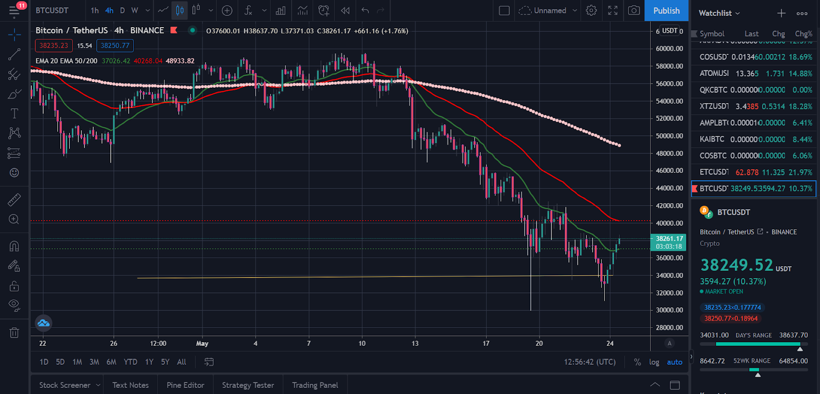
Understanding price actions starts with the understanding of entry-level Candlestick charts. A Candlestick chart forms the basis of technical analysis. Upon this knowledge, we can bring out important concepts like Support and Resistance, market trends, and price actions right from the chart.
What is a Candlestick Chart?
As the name implies, this is a price action chart that involves numerous candles, which shows what the market is saying at a particular period. Unlike the other tools that indicate price action, Candlestick is way more comprehensive as they give the Open, Close, High, and Low price at a given instance.
OHLC, as they are called, is not placed statically on the candle as the location of each of these indicators is determined by whether the market is a Bearish(Sellers) market or a Bullish (Buyers) market.
How Does It Work?
For example, in a bullish candle, the “High” is placed at the top of the upper wick(or shadow), indicating the extent of the price before sellers stepped in. The Closing price is typically above the opening price, and the low of the candle is at the tip of the lower wick shows buyers strength when sellers attempted to push the price lower.

The opening price is typically above the close price for a Bearish Candlestick, indicating a declining price action. The High and Low indicate the attempt of the buyers to change the direction of the market trend.
The candle’s body is the point between the opening and closing price, and they indicate the strength of the dominating actors in the present market.
The colors of the candles are not cast in stone as they can be changed to trader preference. It’s, however, usual to see green used for a bullish candle, while red for a bearish candle. Traders also use other colors, including purple and blue, black and white, ash and brown.
How It Relates to Time Frame
The candles are given per period, meaning each candle on a 4-hour time frame indicates the market action for 4 hours; by lowering or increasing the timeframes, traders can see the market on a Micro or Macro level.

For example, tweaking your timeframe into a 1hr TF will zoom in your chart to split a 4hrs chart into 1hr candle each, giving you much more specific details of the price action for 4hrs.

Changing the time frame to a much bigger time frame, e.g., monthly, is now what we call zooming out, giving traders a broader perspective of the market.
Heikin-Ashi Candlesticks
Heikin-Ashi Candlestick is the modified version of the Japanese Candlestick, which has been expanded above. It uses the same concepts as the Japanese; the difference is that in Heikin-Aishi, the Candles are modified to give the average price. The main goal is to smooth out price action and filter out market noise, as traders can easily spot trends with this Candlestick type.
Different Shapes of a Candlestick and What They Mean
Depending on where these different candles are placed in the chart, they can give traders insight into what may happen in the market. Here are three more different types of candlestick patterns and their respective qualities.
Doji Candlestick
The Doji is a single candle pattern and is neither bearish or bullish as Doji represents a state where the price closes precisely where it opened. For this reason, the Doji appears as a dash as it has no candle body.

Hammer Candlestick
Depending on where they are placed, hammer Candlestick may indicate trend reversals. This Candlestick pattern usually has a small body at the top or bottom with longer wicks at any of the two sides.

Hammer and Inverted Hammer: Same shapes appearing at the support region of a chart in a bearish trend indicating a bullish reversal incoming.
Hanging Man and Shooting Star: Same shapes as the Hammer and Inverted Hammer usually appear during a bull trend at the resistance areas in the chart, indicating an incoming reversal of the prevailing trend.
Engulfing Candle
This typically involves a random and a bigger candle engulfing the smaller candle. As with the Hammer family, this depends on the area of support to indicate a trend reversal.

Bearish Engulfing candlestick appears in support with a big red candlestick engulfing the smaller green candle. Bullish Engulfing candle doing the same at the support zone, indicating a bullish trend incoming.
What’s the Appeal?
At every point in time, traders can look at the chart, place the chart in a Candlestick pattern, and grab a feel/perceptive of how the market is doing per time. With consistency, mastery, and application, a trader can correctly time the market, get accurate entries, and exit by understanding price action via Candlestick formations.
Weaknesses
Candlesticks charts by themselves do not have a weakness. However, its weakness may come from the trader using it. For example, as with other technical indicators, Candlestick does not work in isolation. Even though the chart pattern tends to give an idea about the market per period, it works best with experienced minds that can extrapolate future trends as well as what is happening in the present.
A constant honing of the skills and mastering Candlestick will eliminate almost all possible weaknesses caused by human errors. This doesn’t mean traders will always make the right decision, but they will usually set themselves up for success if they master the method.
Source : bsc.news
Founded in 2020, BSCNews is the leading media platform covering decentralized finance (DeFi) on the Binance Smart Chain (BSC). We cover a wide range of blockchain news revolving mainly around the DeFi sector of the crypto markets. BSCNews aims to inform, educate and share information with the global investment community through our website, social media, newsletters, podcasts, research, and live ask me anything (AMA). Our content reaches hundreds of thousands of global investors who are active in the BSC DeFi space.
BSC NEWS is a private news network. All posts posted by this user belong 100% to bsc.news All rights are reserved to BSC NEWS for more information about BSC NEWS contact BSC NEWS HERE.